Brand Red Refresh
If you noticed Shotomatic's website rebrand first, the app now catches up with the same brand red and charcoal system.

If you've been following Shotomatic through the website, you may have already noticed the rebrand there first. The app now catches up with that same direction by replacing the older purple-heavy styling with our brand red and charcoal system, so the website, logo, and app feel like one product instead of adjacent visual directions. Large surfaces stay neutral, and the interface still leans into a restrained macOS-native feel.
Brand Direction
One goal of this refresh was simple: make the app feel like the same product people already recognize from the website and the Shotomatic logo.
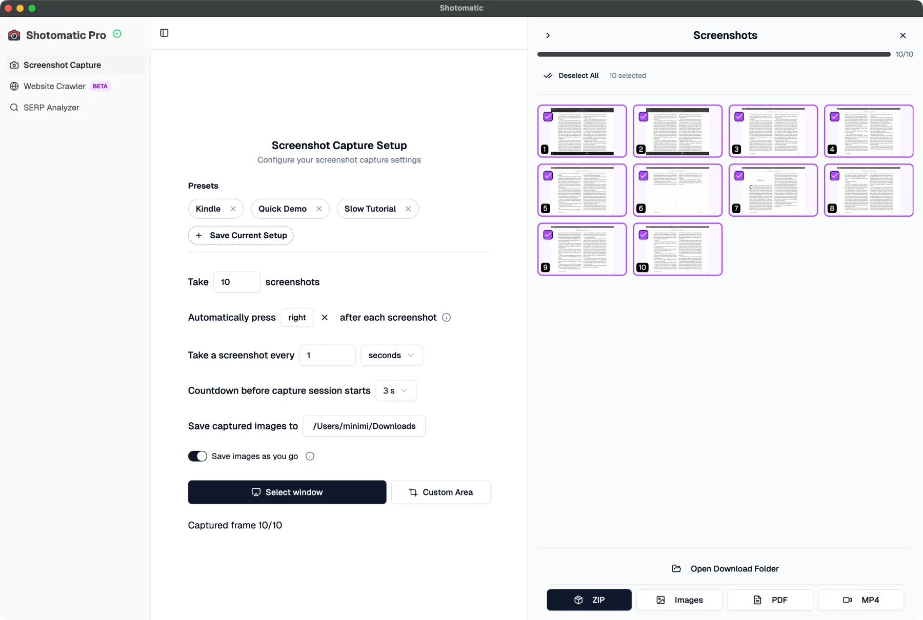
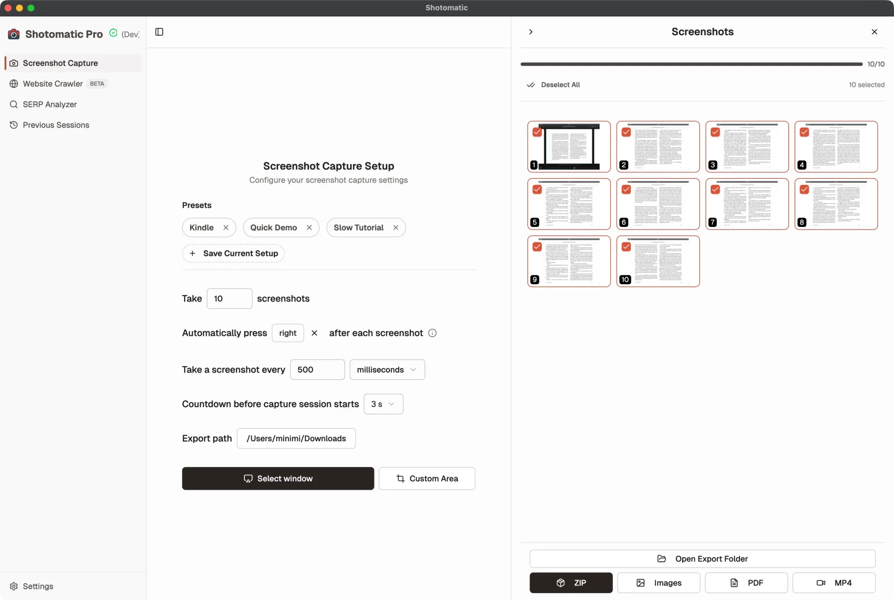
Before vs After
Before, the app leaned on a more generic purple accent language.
After the refresh, the app lines up with Shotomatic's brand red and charcoal system.
What's Improved
- Old purple accents are replaced with Shotomatic's brand red across selection, progress, and checked states.
- Brand charcoal now carries more structural weight for boundaries, emphasis, and stronger UI framing.
- The app now matches the logo and website more closely instead of feeling like it uses a separate accent system.
- Shared UI states feel more consistent across capture flows instead of mixing multiple accent directions.
- Visual noise is reduced by keeping panels and repeated surfaces neutral instead of tinting everything.
Why It Matters
The redesign makes state changes easier to read while giving Shotomatic a more cohesive identity across the website and the app. Important controls still stand out, but the app feels calmer, more polished, and more recognizably Shotomatic instead of relying on a generic purple UI language.
Related Features & Updates
Related Features
Other Updates
Enhanced Capture Settings & Controls
Interval controls support multiple time units, countdown options are fully customizable, and screenshot settings now persist across sessions.
Website Capture Is Now Stable
The old Website Crawler is now Website Capture, with a steadier batch workflow and capture options you can adjust for each URL.
Ready to upgrade your screenshot workflow?
Make it automatic. Save your time.